In short
- The kitchen colour trends for 2026 centre on visible wood, mainly oak and walnut, and earthy tones such as olive, sage, terracotta and sand.
- All-white kitchens are losing ground to wood fronts and matt finishes, but a white kitchen is still a sound choice, especially with a wood element to warm it up.
- The safest scheme is one wood and one colour, with the worktop and walls in a neutral, and the strongest colour kept below eye level.
- In a small or dark kitchen, light oak, a pale worktop and warm white walls work best, with walnut or deep green kept to part of the cabinetry.
Of all the choices in a new kitchen, colour is the one you see most and the hardest to change later. The kitchen colour trends for 2026 point one way: less white on every front, more visible wood, earthy tones and matt finishes. Below is what is changing, how to pair wood with colour, what ages well, and what to choose when the kitchen is small or short of daylight.
Kitchen colour trends 2026: why all-white is losing ground
For a decade, the plain all-white kitchen was the safe choice. For many people it still is, but it is no longer the only one. The shift began with the warm palettes of 2025. Pantone chose a brown, Mocha Mousse, as its colour of the year, and in Portugal the property site idealista listed the return of dark wood among that year's decorating trends.
In 2026 the idea took hold. At the EuroCucina fair in Milan, woodgrain and earthy tones took over the place cool greys used to have.
There are practical reasons too. Wood and earthy tones hide everyday marks better than glossy white. And in a kitchen open to the living room, which is how many renovated flats around Lisbon are laid out, wood makes the kitchen feel like part of the living space.
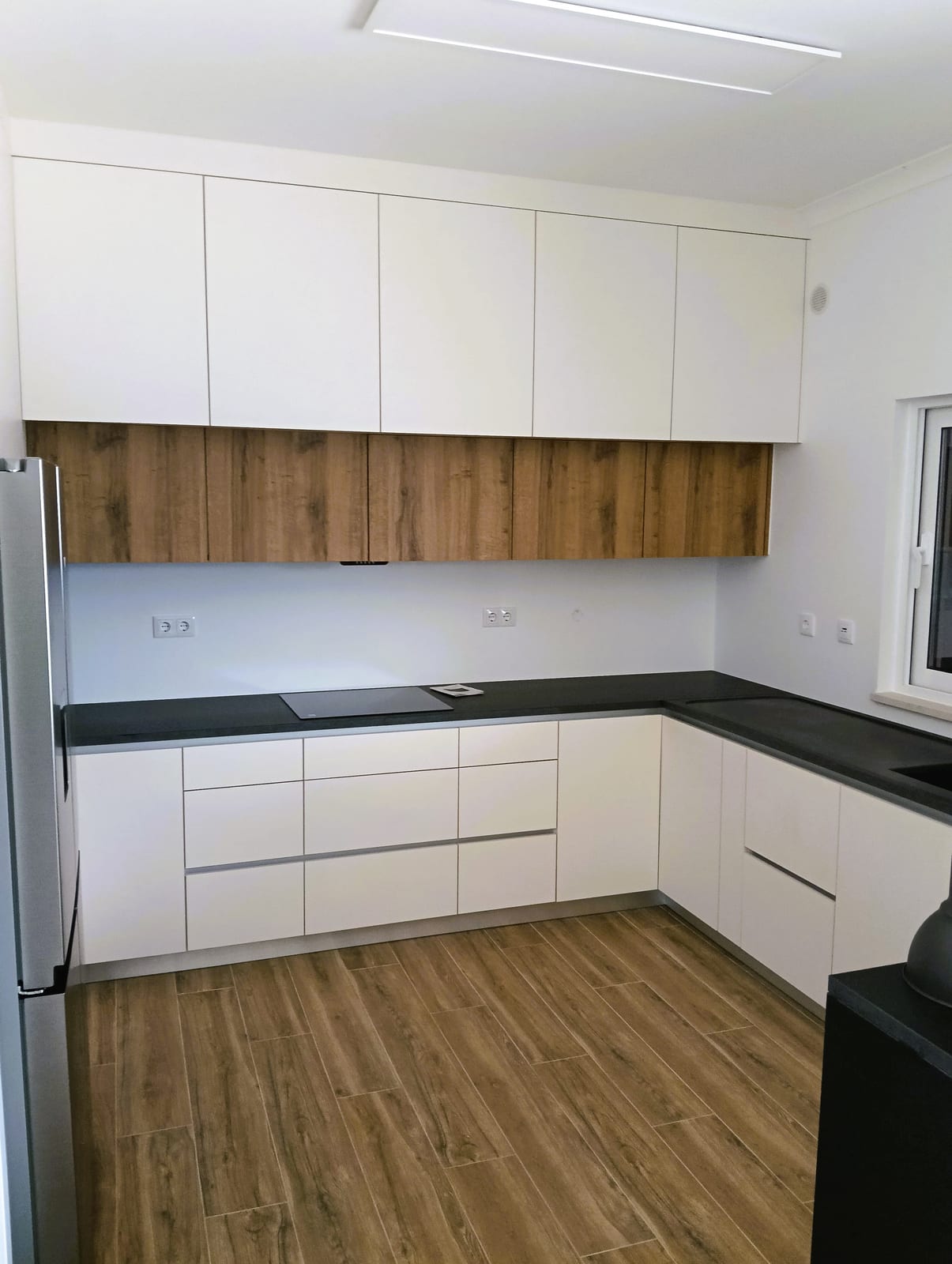
A trend is not a rule. A well-designed white kitchen will not look wrong in 2027. What does look dated now is pure white on every front with nothing to warm it. A strip of wood, an open shelf or a warm worktop is enough to bring it up to date.
Wood kitchen cabinets: oak, walnut or both
For wood kitchen cabinets, the two species you see most are oak and walnut, and they do different jobs.
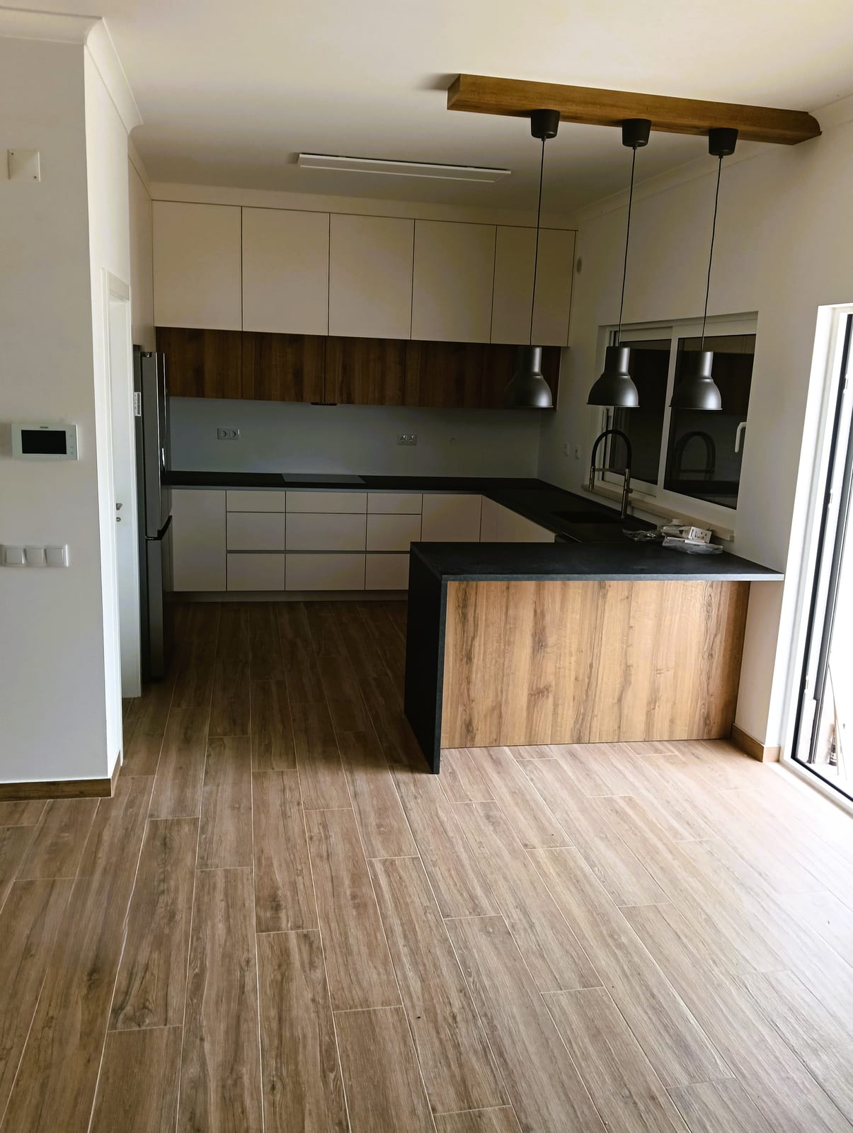
Oak is light, with a visible grain and a colour between honey and sand. It opens up a room, goes with nearly every colour and is hard to get wrong. It works for a whole kitchen or just part of one.
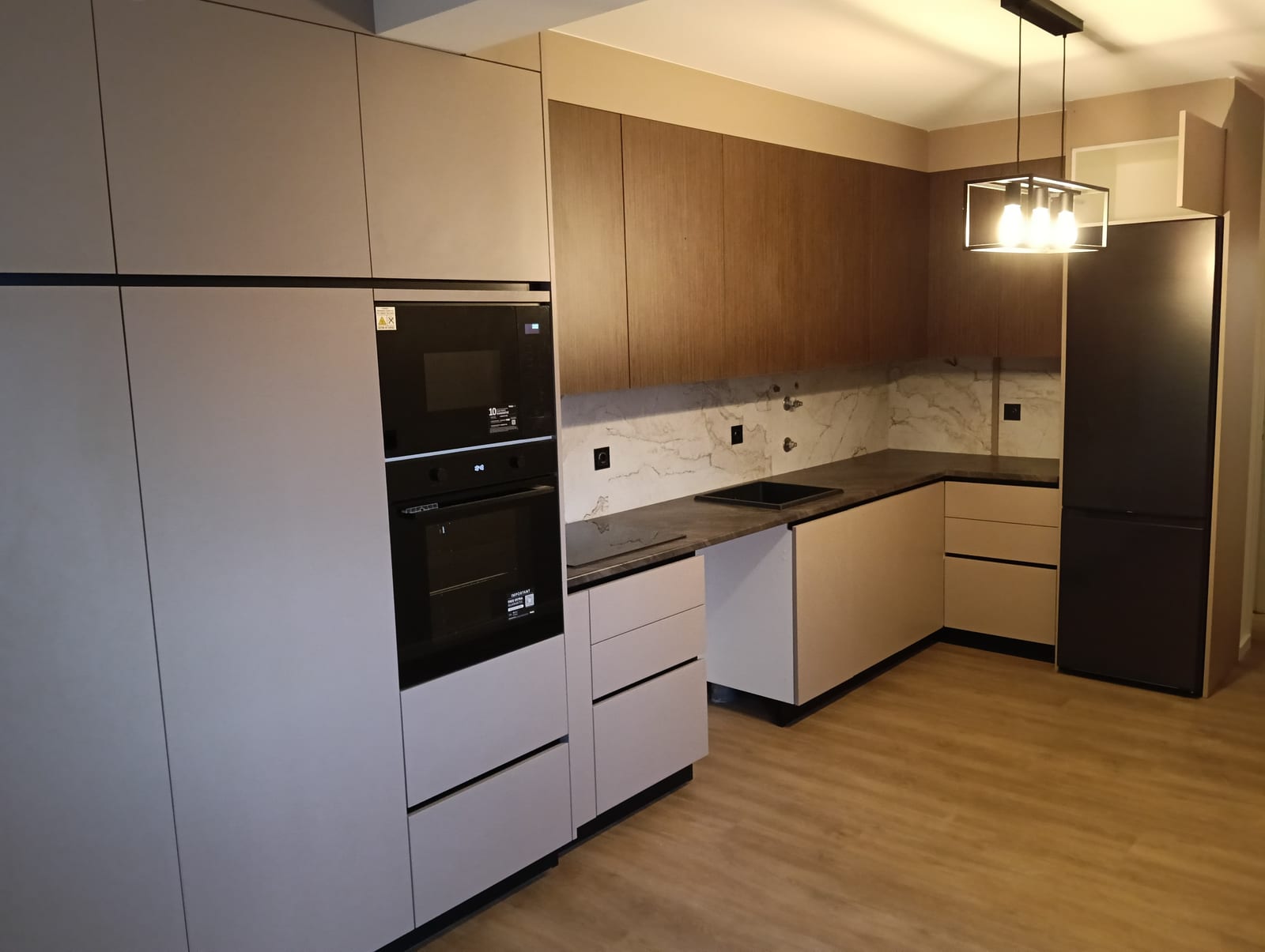
Walnut is a warm dark brown with a wavier grain. It feels calmer and closer to living room furniture. In a large, well-lit kitchen it can cover every front. In a mid-sized one it works better on the wall units, a tall unit or the island.
There are two ways to get wood on the fronts: real wood veneer bonded to a board, or a board with a wood-effect finish. Real wood changes colour in sunlight over the years. Oak tends to turn more yellow, walnut tends to lighten. A wood-effect board keeps its colour and copes better with damp and knocks. On our fitted kitchens, the fronts are thermolaminated board or MDF, and you see the colour and texture samples at the visit, against the real light in your kitchen.
Olive, sage, terracotta and sand: pairing wood with colour
The colours that go with wood in 2026 come from earth and plants. Olive and sage are the most requested. Terracotta, sand, beige and soft browns round out the palette.
The simplest rule is one wood, one colour and one neutral. The wood brings warmth, the colour brings character, and the neutral (worktop, walls, splashback) gives the eye somewhere to rest.
Pairings that work:
- Oak with olive or sage. The colour on the base units, oak on the wall units or a tall unit. The most popular pairing and one of the easiest to live with.
- Oak with sand or beige. Almost tonal and very calm, for anyone who likes the quiet of white but wants it warmer.
- Walnut with cream or greige. The walnut stands out and the pale tone stops the kitchen getting dark.
- Wood with charcoal or matt black. More graphic. Needs a pale worktop or light walls so the room does not close in.
- Terracotta on the floor or splashback. Terracotta is easier to live with on a surface than on the fronts, and it suits oak and sand.
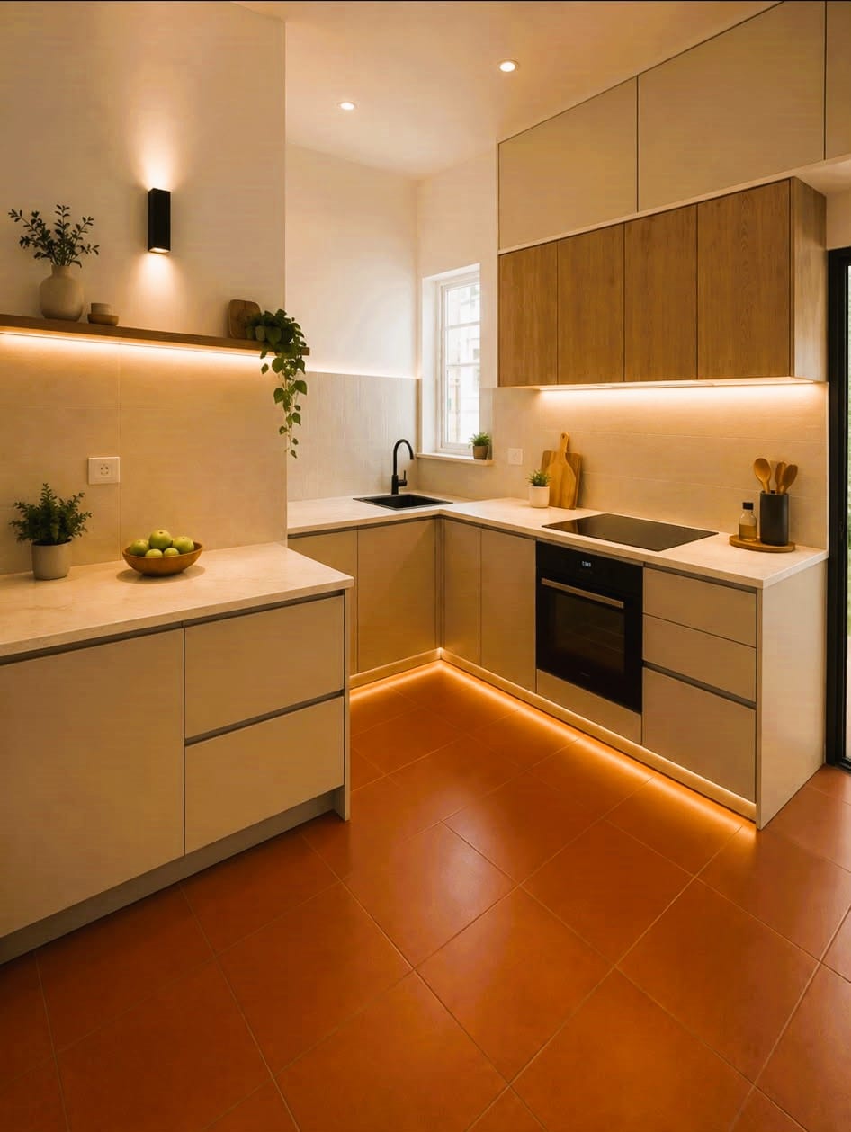
If the kitchen opens onto the living room, look at the floor and the furniture you already have. The kitchen wood does not have to match the floor, but it should share its temperature. Two warm woods sit happily together. A warm wood next to a cool one looks like a mistake.
Matt finish, worktop and light: what ages well
Matt has replaced gloss in most new kitchens. It does not reflect light, it hides small scratches and it gives earthy colours the soft look that makes them so easy to live with. There is one catch: on dark colours, fingerprints show more. On a deep green or matt black, ask for a finish with an anti-fingerprint treatment.
The worktop decides whether the kitchen feels light or heavy. With wood or coloured fronts, a pale worktop in acrylic stone or an ultracompact surface, plain or with a subtle vein, balances the scheme. A dark worktop works with pale oak or light fronts, but with walnut and deep green it tends to make the room feel closed in.
Light changes colour more than people expect. A sage green in a north-facing kitchen looks grey. The same green facing south looks warmer. LED strip lighting under the wall units brings out the wood grain and lights the worktop where you prepare food. Choose the colour with the sample held against a wall in your own kitchen, in the morning and in the evening.
As for what ages well: natural oak, warm white, cream and greyed greens have lasted for decades. Highly saturated colours and high gloss are what date a kitchen fastest. If you love a strong colour but worry about tiring of it, put it somewhere that is easier to change, such as the island, a shelf or the wall.
Colours for a small or dark kitchen
In a small kitchen, or one with little daylight, colour has to work for the space. That does not mean going back to all-white.
- Light or pale oak fronts. They reflect light and keep the kitchen warm.
- Worktop and walls in the same pale tone. Fewer lines across the room make it feel larger.
- Strong colour low down. Olive or walnut on the base units, with pale wall units, adds character without lowering the ceiling.
- Wall units up to the ceiling, in the wall colour. They disappear and make the kitchen feel taller.
- Lighting under the wall units. In a dark kitchen, it is the simplest way to get light onto the worktop.
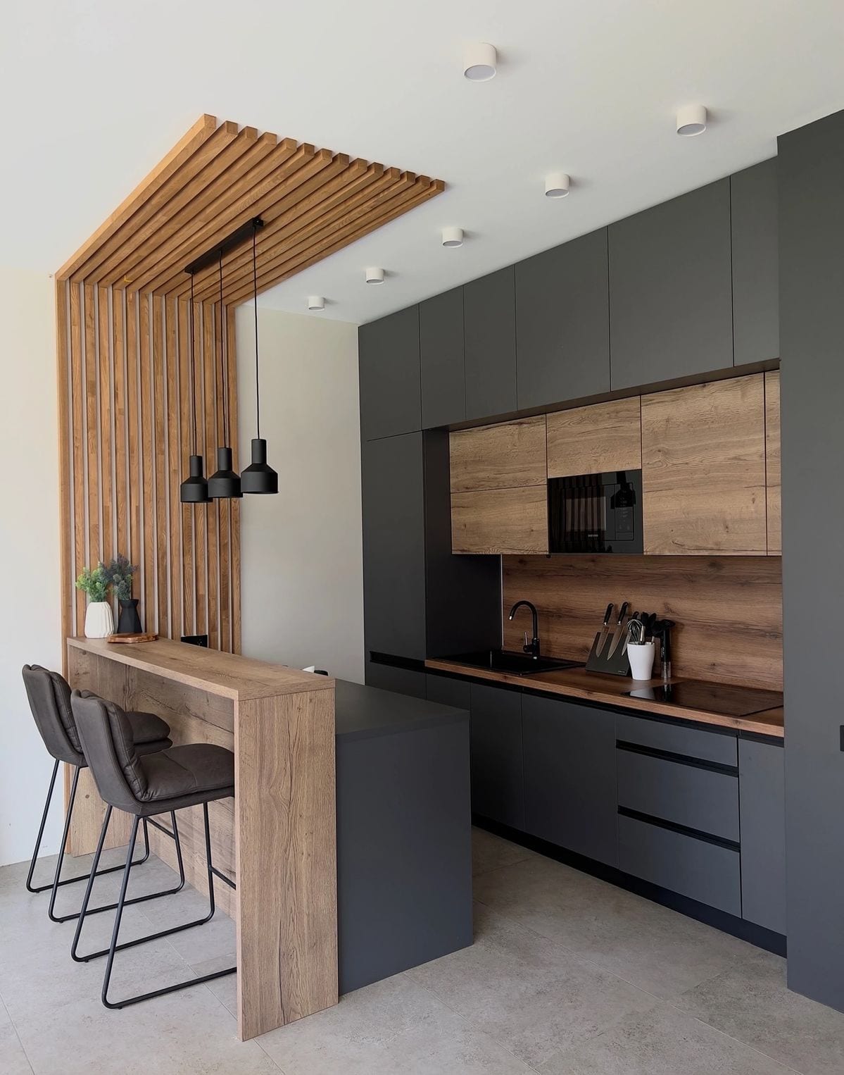
A dark kitchen in strong colours can work, but it needs a generous window or an opening onto a bright living room. When the layout is changing too, say with a kitchen island or peninsula, the centre piece is often the right place to be bold with colour. And if you are still weighing up whether the kitchen should be drawn to the room, read what changes between a bespoke or modular kitchen.
Kitchen colours and woods compared
| Wood or colour | Effect | Best for | Pairs with |
|---|---|---|---|
| Pale oak | Bright, warm, opens up the room | Almost any kitchen, small ones included | Green, sand, warm white, pale or dark worktop |
| Walnut | Dark, calm, living room feel | Large, well-lit kitchens, or just part of one | Cream, beige, pale veined worktop |
| Olive or sage | Calm, natural | Medium and large kitchens, or base units | Oak, pale worktop, brass |
| Terracotta | Warm, Mediterranean | Best on the floor or splashback | Oak, sand, warm white |
| Sand, beige, cream | Warm neutral | Small and dark kitchens | Any wood |
| Charcoal or matt black | Graphic, high contrast | Open-plan, well-lit kitchens | Oak, pale walls and worktop |
| Warm white | Classic, bright | Any kitchen | A wood element |
Before you decide, take two or three samples into the kitchen and look at them in morning light and under the lamps at night. The colour that wins in both is usually the right one.
Frequently asked questions
What kitchen colours are in for 2026?
Visible wood and earthy tones such as olive green, sage, terracotta and sand, nearly always in a matt finish. Pure white on every front is what is losing the most ground.
Are white kitchens going out of style?
They are not wrong. They are simply no longer the automatic choice. A white kitchen with some wood, on the wall units, a shelf or the worktop, still looks current and is one of the schemes that ages best.
Oak or walnut kitchen cabinets?
Oak is lighter and makes a room feel bigger, so it suits almost any kitchen. Walnut is darker and warmer, and needs good natural light or a large room, or else just part of the cabinetry in walnut.
What colours go with wood kitchen cabinets?
Earthy tones pair most easily: olive, sage, sand, beige and terracotta. Charcoal and matt black work too, as long as the worktop or the walls bring in some light.
What colour is best for a small, dark kitchen?
Light or pale oak fronts, a light worktop and walls in warm white or sand. If you want a strong colour, put it on the base units, and add lighting under the wall cabinets.
Which kitchen colours never date?
Natural oak, warm white, cream and greyed greens have lasted for decades. Highly saturated colours and high gloss are what date a kitchen fastest.